TA class
New Project
File > New Project..
New Project
Set the directory name and the subdirectory.
R Markdown
You can write the report with RMarkdown. It can generate HTML, PDF, Word, and PPT documents. Furthermore, math equations can be write with LaTex format.
Find the cheet sheet from Help > Cheetsheets > R Markdown Cheet Sheet
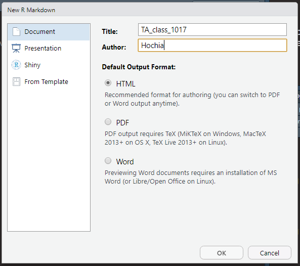
Create your R Markdown!

R Markdown
Add the title and author name.
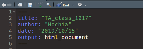
Setup
Kick the “Knit” button.
Knit
Then you will see the following example.
R Markdown
This is an R Markdown document. Markdown is a simple formatting syntax for authoring HTML, PDF, and MS Word documents. For more details on using R Markdown see http://rmarkdown.rstudio.com.
When you click the Knit button a document will be generated that includes both content as well as the output of any embedded R code chunks within the document. You can embed an R code chunk like this:
summary(cars)
#>      speed           dist
#>  Min.   : 4.0   Min.   :  2.00
#>  1st Qu.:12.0   1st Qu.: 26.00
#>  Median :15.0   Median : 36.00
#>  Mean   :15.4   Mean   : 42.98
#>  3rd Qu.:19.0   3rd Qu.: 56.00
#>  Max.   :25.0   Max.   :120.00
Including Plots
You can also embed plots, for example:
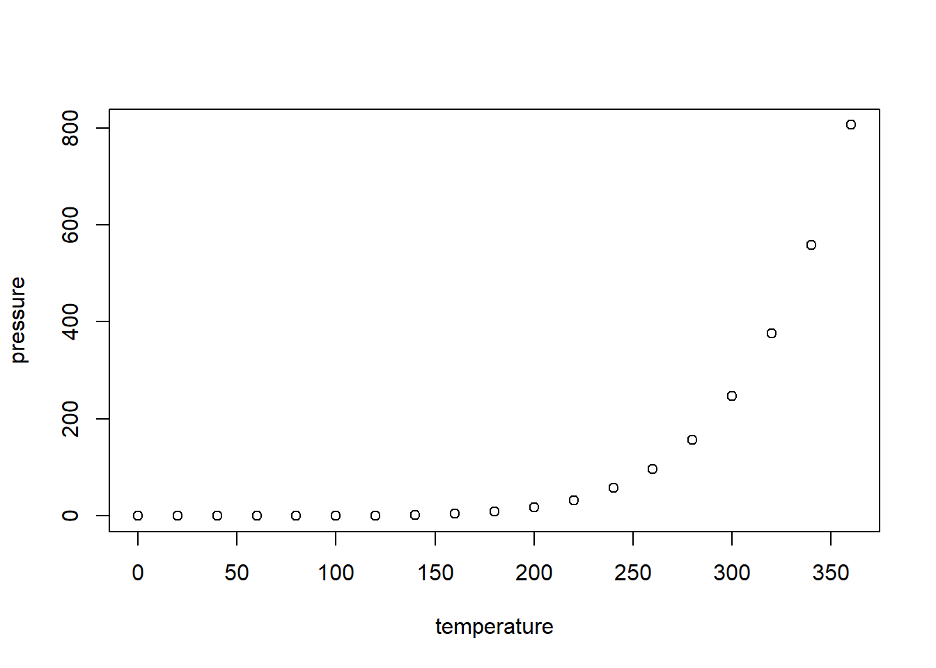
Note that the echo = FALSE parameter was added to the code chunk to prevent printing of the R code that generated the plot.
R Code Chunks
shortcut
Ctrl + Alt + I on Windows
Cmd + Option + I on macOS
Add your R code in code chunk, then R Markdown will run it.
```{r}
summary(cars)
```
This is what you see in the document.
summary(cars)
#>      speed           dist
#>  Min.   : 4.0   Min.   :  2.00
#>  1st Qu.:12.0   1st Qu.: 26.00
#>  Median :15.0   Median : 36.00
#>  Mean   :15.4   Mean   : 42.98
#>  3rd Qu.:19.0   3rd Qu.: 56.00
#>  Max.   :25.0   Max.   :120.00
You can embed the variable in the document.
```{r}
x = 5  # radius of a circle
```
For a circle with the radius `r x`,
its area is `r pi * x^2`.Then you will see this.
x = 5 # radius of a circleFor a circle with the radius 5, its area is 78.5398163.
LaTex
Use $ to add math equations in the paragraph.
the acceptance rate in $95\%$ confidence
the acceptance rate in \(95\%\) confidence
Use $$ to add math equations in single or multiple lines.
$$
f_X(x) = {x-1 \choose r-1} p^r (1-p)^{x-r} I_{(r,r+1, \dots)} (x)
$$
\[ f_X(x) = {x-1 \choose r-1} p^r (1-p)^{x-r} I_{(r,r+1, \dots)} (x) \]
$$
\begin{aligned}
f_X(x) = {x-1 \choose r-1} p^r (1-p)^{x-r} I_{(r,r+1, \dots)} (x)
f_X(x) = {x-1 \choose r-1} p^r (1-p)^{x-r} I_{(r,r+1, \dots)} (x)
\end{aligned}
$$
\[ \begin{aligned} f_X(x) = {x-1 \choose r-1} p^r (1-p)^{x-r} I_{(r,r+1, \dots)} (x)\\ f_X(x) = {x-1 \choose r-1} p^r (1-p)^{x-r} I_{(r,r+1, \dots)} (x) \end{aligned} \]
For more information, see Latex in Wiki.
包(Package)
- 為何要用其他的包,base R 不是也有嗎?比如畫圖,R base 有
plot()、boxplot()等。為何要用ggplot2()?
為了彌補之前的漏洞,如果輕易的更動 base, 會癱瘓過去做過的成品。為了避免類似的狀況,所以開發新的方法。
包會整合容易混淆的作法,更一致的表達如何操作。
可是這樣講還是很模糊,要講清楚變成講古。總之我們已經沒必要追究過去怎麼做,只需要與時俱進,學習最新的方法即可。
- 為何選
tidyverse?
在呼叫 tidyverse 的時候會看到下面的資訊:
library(tidyverse)tidyverse 整合 ggplot2, purrr, tibble, dplyr, tidyr, stringr, readr, forcats,海羅了處理資料的基本方法。
今天進一步介紹 dplyr ,還有開始使用 ggplot2。
- 為何寫成
ggplot2::mpg?兩個冒號::是什麼?
告訴大家 mpg 是在 ggplot2 包。同理,dplyr::select() 告訴大家 select() 在 dplyr 包。暫時可以把 :: 當作一種方法,代表取包裡的東西。當然你不能寫成 ggplot2$mpg,因為 $ 是取資料的變數,比如 mpg$cty,是另外一種方法。
- 有推薦其他寫程式的好方法嗎?
有,複製別人寫好的,貼上運行。因為我們要站在巨人的肩膀上。
dplyr 資料轉換 & ggplot2 資料視覺化
資料轉換和資料視覺化的內容很豐富,所以會在未來的課程不斷的加入新的內容,持續堆疊下去。如果有不熟悉的地方,也許可以考慮複習一下先前教過的內容。
Wrangle with Data
Prerequisite
# install.packages("tidyverse")
library(tidyverse)
Tidyverse contains the packages you may need to use in data science, including ggplot2, dplyr, etc. So you do not need to install them individually.
Data
ggplot2::mpg
#> # A tibble: 234 x 11
#>    manufacturer model    displ  year   cyl trans   drv     cty   hwy fl    class
#>    <chr>        <chr>    <dbl> <int> <int> <chr>   <chr> <int> <int> <chr> <chr>
#>  1 audi         a4         1.8  1999     4 auto(l~ f        18    29 p     comp~
#>  2 audi         a4         1.8  1999     4 manual~ f        21    29 p     comp~
#>  3 audi         a4         2    2008     4 manual~ f        20    31 p     comp~
#>  4 audi         a4         2    2008     4 auto(a~ f        21    30 p     comp~
#>  5 audi         a4         2.8  1999     6 auto(l~ f        16    26 p     comp~
#>  6 audi         a4         2.8  1999     6 manual~ f        18    26 p     comp~
#>  7 audi         a4         3.1  2008     6 auto(a~ f        18    27 p     comp~
#>  8 audi         a4 quat~   1.8  1999     4 manual~ 4        18    26 p     comp~
#>  9 audi         a4 quat~   1.8  1999     4 auto(l~ 4        16    25 p     comp~
#> 10 audi         a4 quat~   2    2008     4 manual~ 4        20    28 p     comp~
#> # ... with 224 more rows
?ggplot2::mpg # For more information
Or you can simply call ?mpg if you had already call the library.
dplyr 資料轉換
未來的課程總共會涵蓋下列 dplyr 中的函數:
filter()andselect()group_by()andungroup()summarize()andsummarise()arrange()anddesc()mutate()
Select columns with select()
df <- select(mpg, manufacturer, cty, hwy, class)
df
summary(df)
table(df %>% select(manufacturer, class))
df <- select(mpg, manufacturer, cty, hwy, class)
df
#> # A tibble: 234 x 4
#> manufacturer cty hwy class
#> <chr> <int> <int> <chr>
#> 1 audi 18 29 compact
#> 2 audi 21 29 compact
#> 3 audi 20 31 compact
#> 4 audi 21 30 compact
#> 5 audi 16 26 compact
#> 6 audi 18 26 compact
#> 7 audi 18 27 compact
#> 8 audi 18 26 compact
#> 9 audi 16 25 compact
#> 10 audi 20 28 compact
#> # ... with 224 more rows
summary(df)
#> manufacturer cty hwy class
#> Length:234 Min. : 9.00 Min. :12.00 Length:234
#> Class :character 1st Qu.:14.00 1st Qu.:18.00 Class :character
#> Mode :character Median :17.00 Median :24.00 Mode :character
#> Mean :16.86 Mean :23.44
#> 3rd Qu.:19.00 3rd Qu.:27.00
#> Max. :35.00 Max. :44.00
table(df %>% select(manufacturer, class))
#> class
#> manufacturer 2seater compact midsize minivan pickup subcompact suv
#> audi 0 15 3 0 0 0 0
#> chevrolet 5 0 5 0 0 0 9
#> dodge 0 0 0 11 19 0 7
#> ford 0 0 0 0 7 9 9
#> honda 0 0 0 0 0 9 0
#> hyundai 0 0 7 0 0 7 0
#> jeep 0 0 0 0 0 0 8
#> land rover 0 0 0 0 0 0 4
#> lincoln 0 0 0 0 0 0 3
#> mercury 0 0 0 0 0 0 4
#> nissan 0 2 7 0 0 0 4
#> pontiac 0 0 5 0 0 0 0
#> subaru 0 4 0 0 0 4 6
#> toyota 0 12 7 0 7 0 8
#> volkswagen 0 14 7 0 0 6 0Filter rows with filter()
Logic “and”
filter(df, class == "compact", cty < 20)
#> # A tibble: 21 x 4
#>    manufacturer   cty   hwy class
#>    <chr>        <int> <int> <chr>
#>  1 audi            18    29 compact
#>  2 audi            16    26 compact
#>  3 audi            18    26 compact
#>  4 audi            18    27 compact
#>  5 audi            18    26 compact
#>  6 audi            16    25 compact
#>  7 audi            19    27 compact
#>  8 audi            15    25 compact
#>  9 audi            17    25 compact
#> 10 audi            17    25 compact
#> # ... with 11 more rows
Logic “or”
These three are equivalent.
filter(df, class == "compact" | class == "suv")
df %>% filter(class == "compact" | class == "suv")
df %>% filter(class %in% c("compact", "suv"))
filter(df, class == "compact" | class == "suv")
#> # A tibble: 109 x 4
#> manufacturer cty hwy class
#> <chr> <int> <int> <chr>
#> 1 audi 18 29 compact
#> 2 audi 21 29 compact
#> 3 audi 20 31 compact
#> 4 audi 21 30 compact
#> 5 audi 16 26 compact
#> 6 audi 18 26 compact
#> 7 audi 18 27 compact
#> 8 audi 18 26 compact
#> 9 audi 16 25 compact
#> 10 audi 20 28 compact
#> # ... with 99 more rows
df %>% filter(class == "compact" | class == "suv")
#> # A tibble: 109 x 4
#> manufacturer cty hwy class
#> <chr> <int> <int> <chr>
#> 1 audi 18 29 compact
#> 2 audi 21 29 compact
#> 3 audi 20 31 compact
#> 4 audi 21 30 compact
#> 5 audi 16 26 compact
#> 6 audi 18 26 compact
#> 7 audi 18 27 compact
#> 8 audi 18 26 compact
#> 9 audi 16 25 compact
#> 10 audi 20 28 compact
#> # ... with 99 more rows
df %>% filter(class %in% c("compact", "suv"))
#> # A tibble: 109 x 4
#> manufacturer cty hwy class
#> <chr> <int> <int> <chr>
#> 1 audi 18 29 compact
#> 2 audi 21 29 compact
#> 3 audi 20 31 compact
#> 4 audi 21 30 compact
#> 5 audi 16 26 compact
#> 6 audi 18 26 compact
#> 7 audi 18 27 compact
#> 8 audi 18 26 compact
#> 9 audi 16 25 compact
#> 10 audi 20 28 compact
#> # ... with 99 more rowsYou can work this way!
mpg %>%
  select(manufacturer, cty, hwy, class) %>%
  filter(class %in% c("compact", "suv"))
#> # A tibble: 109 x 4
#>    manufacturer   cty   hwy class
#>    <chr>        <int> <int> <chr>
#>  1 audi            18    29 compact
#>  2 audi            21    29 compact
#>  3 audi            20    31 compact
#>  4 audi            21    30 compact
#>  5 audi            16    26 compact
#>  6 audi            18    26 compact
#>  7 audi            18    27 compact
#>  8 audi            18    26 compact
#>  9 audi            16    25 compact
#> 10 audi            20    28 compact
#> # ... with 99 more rows
在挑出這些資料後,我們想比較不同製造商在其中兩種車型的市區油耗的平均值:
分成兩步驟,分類與取平均值。
Step 1: 分類
mpg %>%
  select(manufacturer, cty, hwy, class) %>%
  filter(class %in% c("compact", "suv")) %>%
  group_by(manufacturer, class)
#> # A tibble: 109 x 4
#> # Groups:   manufacturer, class [15]
#>    manufacturer   cty   hwy class
#>    <chr>        <int> <int> <chr>
#>  1 audi            18    29 compact
#>  2 audi            21    29 compact
#>  3 audi            20    31 compact
#>  4 audi            21    30 compact
#>  5 audi            16    26 compact
#>  6 audi            18    26 compact
#>  7 audi            18    27 compact
#>  8 audi            18    26 compact
#>  9 audi            16    25 compact
#> 10 audi            20    28 compact
#> # ... with 99 more rows
可以看到 Groups: manufacturer, class [15] 的訊息。
group_by() 是對某個變數的值做分類。比如 group_by(manufacturer, class) 就是對製造商和車型做分類。
仔細觀察資料的話,會發現並不是所有製造商都有這兩種車型被記錄在資料裡。
#> Error in datatable(df): could not find function "datatable"Step 2: 取平均值
mpg %>%
  select(manufacturer, cty, hwy, class) %>%
  filter(class %in% c("compact", "suv")) %>%
  group_by(manufacturer, class) %>%
  summarise(avg = mean(cty))
#> `summarise()` has grouped output by 'manufacturer'. You can override using the `.groups` argument.
#> # A tibble: 15 x 3
#> # Groups:   manufacturer [12]
#>    manufacturer class     avg
#>    <chr>        <chr>   <dbl>
#>  1 audi         compact  17.9
#>  2 chevrolet    suv      12.7
#>  3 dodge        suv      11.9
#>  4 ford         suv      12.9
#>  5 jeep         suv      13.5
#>  6 land rover   suv      11.5
#>  7 lincoln      suv      11.3
#>  8 mercury      suv      13.2
#>  9 nissan       compact  20
#> 10 nissan       suv      13.8
#> 11 subaru       compact  19.8
#> 12 subaru       suv      18.8
#> 13 toyota       compact  22.2
#> 14 toyota       suv      14.4
#> 15 volkswagen   compact  20.8
summarise() 和 summarize() 功能一樣,純粹是英美式差異。
summarise() 會整合成另一個資料框,avg 是變數名稱,
mean() 是整合的方式,計算 cty 的平均值。
可是想加入高速公路油耗進行比較,要怎麼辦呢?複製貼上,改 cty 為 hwy 是一種作法,但不是很高明。如果要把製造商的 cty 和 hwy 的平均值整理在一起又要再多一個步驟。
這件事情可以用 summarise() 一次做完:
mpg %>%
  select(manufacturer, cty, hwy, class) %>%
  filter(class %in% c("compact", "suv")) %>%
  group_by(manufacturer) %>%
  summarise(cty_avg = mean(cty), hwy_avg = mean(hwy))
#> # A tibble: 12 x 3
#>    manufacturer cty_avg hwy_avg
#>  * <chr>          <dbl>   <dbl>
#>  1 audi            17.9    26.9
#>  2 chevrolet       12.7    17.1
#>  3 dodge           11.9    16
#>  4 ford            12.9    17.8
#>  5 jeep            13.5    17.6
#>  6 land rover      11.5    16.5
#>  7 lincoln         11.3    17
#>  8 mercury         13.2    18
#>  9 nissan          15.8    21.3
#> 10 subaru          19.2    25.4
#> 11 toyota          19.1    25.6
#> 12 volkswagen      20.8    28.5
可是現在沒辦法直接看出哪個製造商的平均油耗最高最低,我們想要排列資料:
mpg %>%
  select(manufacturer, cty, hwy, class) %>%
  filter(class %in% c("compact", "suv")) %>%
  group_by(manufacturer) %>%
  summarise(cty_avg = mean(cty), hwy_avg = mean(hwy)) %>%
  arrange(cty_avg)
#> # A tibble: 12 x 3
#>    manufacturer cty_avg hwy_avg
#>    <chr>          <dbl>   <dbl>
#>  1 lincoln         11.3    17
#>  2 land rover      11.5    16.5
#>  3 dodge           11.9    16
#>  4 chevrolet       12.7    17.1
#>  5 ford            12.9    17.8
#>  6 mercury         13.2    18
#>  7 jeep            13.5    17.6
#>  8 nissan          15.8    21.3
#>  9 audi            17.9    26.9
#> 10 toyota          19.1    25.6
#> 11 subaru          19.2    25.4
#> 12 volkswagen      20.8    28.5
arrange() 由小到大排列 cty_avg 這個變數。
希望油耗表現最好的排在第一位,就用 desc() 包住 cty_avg。
mpg %>%
  select(manufacturer, cty, hwy, class) %>%
  filter(class %in% c("compact", "suv")) %>%
  group_by(manufacturer) %>%
  summarise(cty_avg = mean(cty), hwy_avg = mean(hwy)) %>%
  arrange(desc(cty_avg))
#> # A tibble: 12 x 3
#>    manufacturer cty_avg hwy_avg
#>    <chr>          <dbl>   <dbl>
#>  1 volkswagen      20.8    28.5
#>  2 subaru          19.2    25.4
#>  3 toyota          19.1    25.6
#>  4 audi            17.9    26.9
#>  5 nissan          15.8    21.3
#>  6 jeep            13.5    17.6
#>  7 mercury         13.2    18
#>  8 ford            12.9    17.8
#>  9 chevrolet       12.7    17.1
#> 10 dodge           11.9    16
#> 11 land rover      11.5    16.5
#> 12 lincoln         11.3    17
市區油耗的表現都不如高速公路的油耗,可能是因為市區會一直塞車,走走停停,所以油耗表現比較差。但是差距有多少呢?
mpg %>%
  select(manufacturer, cty, hwy, class) %>%
  filter(class %in% c("compact", "suv")) %>%
  group_by(manufacturer) %>%
  summarise(cty_avg = mean(cty), hwy_avg = mean(hwy)) %>%
  mutate(difference = hwy_avg - cty_avg)
#> # A tibble: 12 x 4
#>    manufacturer cty_avg hwy_avg difference
#>  * <chr>          <dbl>   <dbl>      <dbl>
#>  1 audi            17.9    26.9       9
#>  2 chevrolet       12.7    17.1       4.44
#>  3 dodge           11.9    16         4.14
#>  4 ford            12.9    17.8       4.89
#>  5 jeep            13.5    17.6       4.12
#>  6 land rover      11.5    16.5       5
#>  7 lincoln         11.3    17         5.67
#>  8 mercury         13.2    18         4.75
#>  9 nissan          15.8    21.3       5.50
#> 10 subaru          19.2    25.4       6.20
#> 11 toyota          19.1    25.6       6.55
#> 12 volkswagen      20.8    28.5       7.71
mutate() 新增變數,變數命名為 difference,是計算
hwy_avg 和 cty_avg 的差異,
- 跟你想的應該一樣,代表減法。
ggplot2 資料視覺化
ggplot(data = mpg) +
  geom_point(mapping = aes(x = cty, y = hwy))
看到 ggplot() 代表要畫圖了,裡面第一個位置放資料 mpg。
這裡的 + 可能跟你想的加法不一樣,
接在 ggplot2 包的函數後面,
就達到跟 %>% 相同的效果。
所以你發現了嗎?這就是個坑,很可能不小心就寫錯。
來看看 RStudio 首席工程師 Hadley 的看法:

ggplot(data = mpg) +
  geom_point(mapping = aes(x = cty, y = hwy))
geom_point() 是畫點圖。
mapping() 是指映射。
aes() 是 asthetic 的簡稱,是美學的意思。
aes() 放的是座標軸,順序是 x 軸 y 軸。
通常會省略 x、y。
通常會把函數的名稱省略,所以 data、mapping、x、y 都可以省略。但是不能更改他們擺放的順序。所以下面兩個是完全不同的映射方式。
ggplot(mpg) +
  geom_point(aes(cty, hwy))
ggplot(mpg) +
  geom_point(aes(hwy, cty))
如果要畫兩種以上的圖,只要用 + 連接即可:
ggplot(data = mpg, mapping = aes(x = cty, y = hwy)) +
  geom_point() +
  geom_smooth(method = lm)
#> `geom_smooth()` using formula 'y ~ x'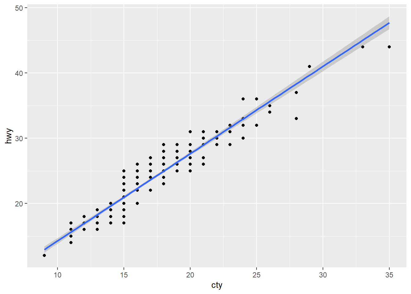
geom_smooth(method = lm) 是指用線性迴歸畫圖,在此不深究這個問題。
寫法有其他種類的變形,來比較一下:
mpg %>%
  ggplot(aes(cty, hwy)) +
    geom_point()

ggplot(mpg, aes(cty, hwy)) +
  geom_point()

ggplot(mpg) +
  geom_point(aes(cty, hwy))

mpg %>%
  ggplot() +
    geom_point(aes(cty, hwy))
第一種是把資料擺在 ggplot() 外頭,再用 %>% 傳到下一步驟。
第二種是把資料擺在 ggplot() 裡面。
第三種把美學擺在畫圖的方式。
或許你能寫出第四種,再想第五種…
但是,別寫成這樣,是錯的:
ggplot(mpg, cty, hwy) +
  geom_point()
#> Error in ggplot.default(mpg, cty, hwy): object 'cty' not found

ggplot(mpg) +
  geom_point(cty, hwy)
#> Error in layer(data = data, mapping = mapping, stat = stat, geom = GeomPoint, : object 'cty' not found
在回到剛才整理過的資料,現在要以視覺化的方式呈現,我們想看出市區與高速公路油耗的差異:
mpg %>%
  select(manufacturer, cty, hwy, class) %>%
  filter(class %in% c("compact", "suv")) %>%
  group_by(manufacturer) %>%
  summarise(cty_avg = mean(cty), hwy_avg = mean(hwy)) %>%
  mutate(difference = hwy_avg - cty_avg) %>%
  ggplot() +
  geom_col(aes(manufacturer, hwy_avg),
           alpha = 0.2, fill = "orange", color = "darkorange") +
  geom_col(aes(manufacturer, difference),
           alpha = 0.3, fill = "violet", color = "purple") +
  coord_flip() +
  theme_classic()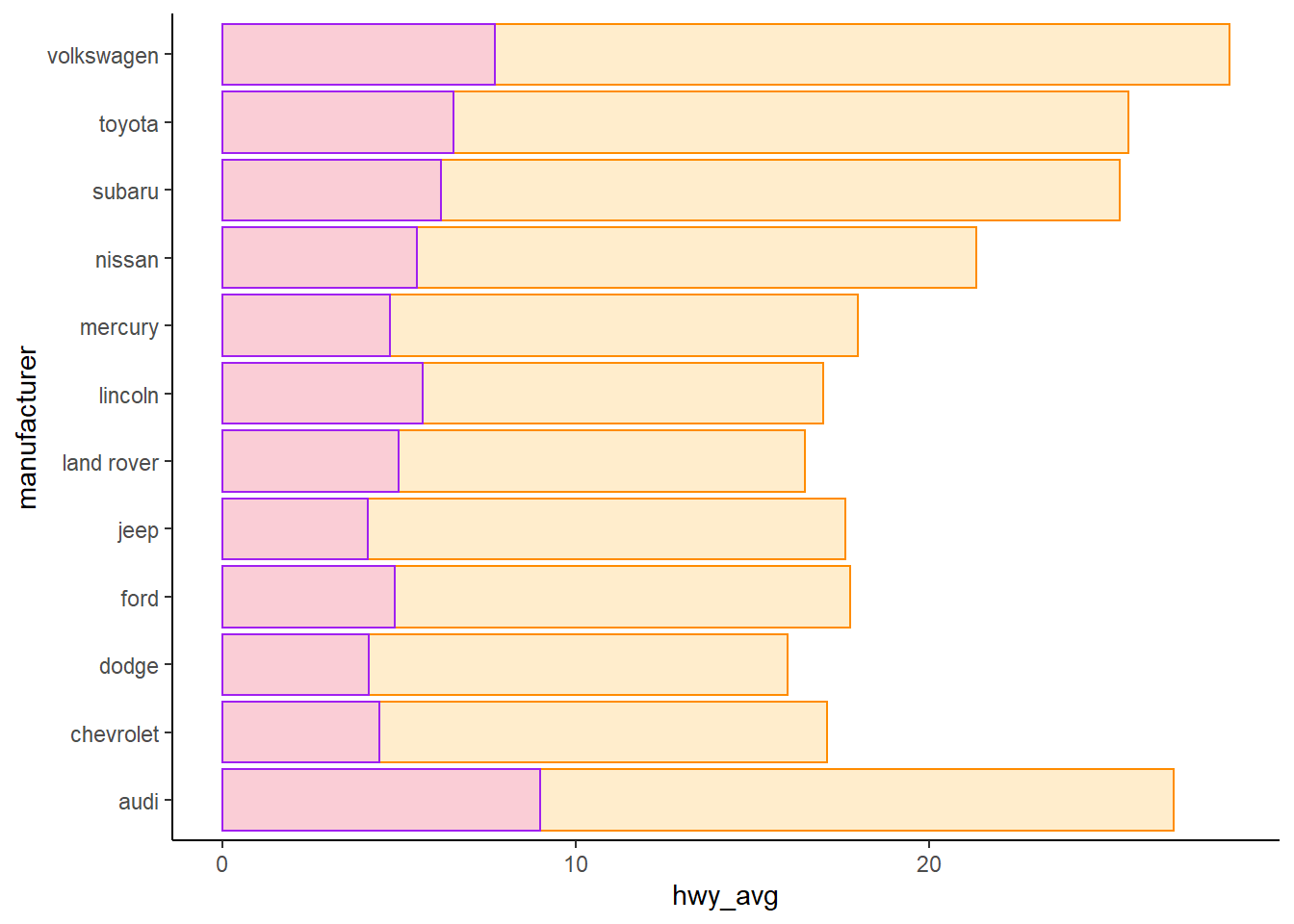
geom_col() 和 geom_boxplot() 都適用於雙變數,一個離散,一個連續。也許你可以試著疊加盒鬚圖與長條圖。
只要用顏色就能區分即可,所以使用 difference 比 cty_avg 更適當。
當然可以自行嘗試使用 cty_avg 的後果。
alpha 設定透明度。
fill 填滿顏色。
color 邊框顏色。
受限於目前的講解內容,我們整理的資料尚未達到“齊整”,應該再做一些調整更容易做事。
齊整資料 : tidy data
Homework
10/17 Homework
Wrangle with ggplot2::mpg and show the result.
Select
manufacturer,year, anddispl.Filter
yearis 1999 anddispl < 2.
Reference solution
#> # A tibble: 234 x 3
#>    manufacturer  year displ
#>    <chr>        <int> <dbl>
#>  1 audi          1999   1.8
#>  2 audi          1999   1.8
#>  3 audi          2008   2
#>  4 audi          2008   2
#>  5 audi          1999   2.8
#>  6 audi          1999   2.8
#>  7 audi          2008   3.1
#>  8 audi          1999   1.8
#>  9 audi          1999   1.8
#> 10 audi          2008   2
#> # ... with 224 more rows
#> # A tibble: 17 x 3
#>    manufacturer  year displ
#>    <chr>        <int> <dbl>
#>  1 audi          1999   1.8
#>  2 audi          1999   1.8
#>  3 audi          1999   1.8
#>  4 audi          1999   1.8
#>  5 honda         1999   1.6
#>  6 honda         1999   1.6
#>  7 honda         1999   1.6
#>  8 honda         1999   1.6
#>  9 honda         1999   1.6
#> 10 toyota        1999   1.8
#> 11 toyota        1999   1.8
#> 12 toyota        1999   1.8
#> 13 volkswagen    1999   1.9
#> 14 volkswagen    1999   1.9
#> 15 volkswagen    1999   1.9
#> 16 volkswagen    1999   1.8
#> 17 volkswagen    1999   1.8
10/24 作業
1. 請觀察下面兩種做法,分別說明會如何計算總數?
其中 n() 是計算總數,命名為 cars。
解除群組做法是用管線接一句 ungroup(),裡面不用再寫其他記號。
df <- mpg %>%
  select(manufacturer, cty, hwy, class) %>%
  filter(class %in% c("compact", "suv")) %>%
  group_by(manufacturer, class)

# 第一種沒有 ungroup
df %>% summarise(cars = n())

# 第二種有 ungroup
df %>%
  ungroup() %>%
  summarise(cars = n())
2. 資料整理的方式如下,
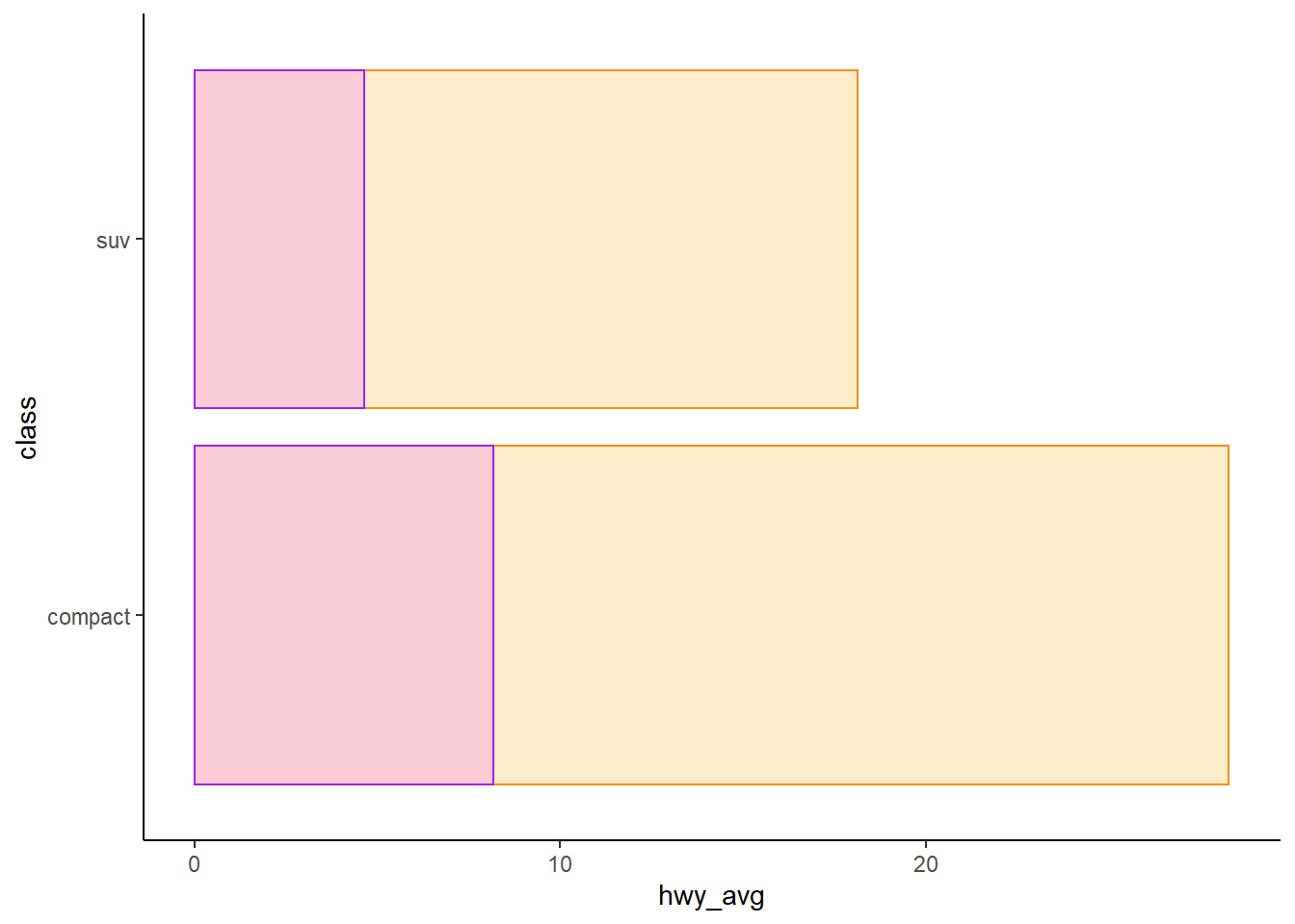
- 接著請畫出製造商在每種車型的市區油耗與高速公路油耗的盒鬚圖。
- 說明
coord_flip()可以解決的問題。 - 說明你喜歡哪一種主題的作圖。比如範例是
theme_classic()畫圖。
提示: geom_boxplot() 的美學在 x 軸是離散的變數,y 軸是連續的變數
當然 color 或是 theme_*() 都可以自行挑選喜歡的。
* 為名稱代換的部分。
mpg %>%
  select(manufacturer, cty, hwy, class) %>%
  filter(class %in% c("compact", "suv")) %>%
  group_by(manufacturer, class) %>%
  ggplot() +
  geom_boxplot(mapping = aes(x = ___, y = ___), color = "violet") +
  geom_boxplot(mapping = aes(x = ___, y = ___), color = "orange") +
  coord_flip() +
  theme_classic()
10/31 作業
1. 比較 compact 和 suv 兩種車型在市區油耗與高速公路油耗的差異。
2. 畫圖表現差異。
Other subjects
迴圈、敘述統計、機率模型
學習目標
比較常態分佈
相同的平均值,不同的標準差
不同的平均值,相同的標準差
資料框 data frame
建立資料框
法一
df <- data.frame(a = 1:3, b = 4:6)#> a b
#> 1 1 4
#> 2 2 5
#> 3 3 6法二
df <- data.frame(
  matrix(1:6, nrow = 3))

names(df) <- c("a", "b")
#> a b
#> 1 1 4
#> 2 2 5
#> 3 3 6法三
df <- data.frame(
  matrix(0, nrow = 3, ncol = 2))

df[[1]] <- 1:3
df[[2]] <- 4:6
#> X1 X2
#> 1 1 4
#> 2 2 5
#> 3 3 6習題
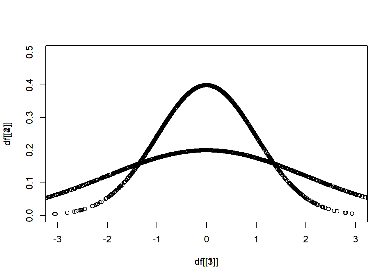
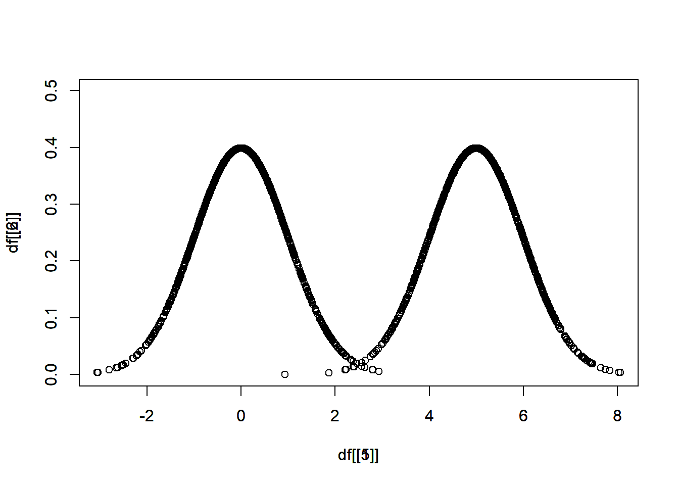
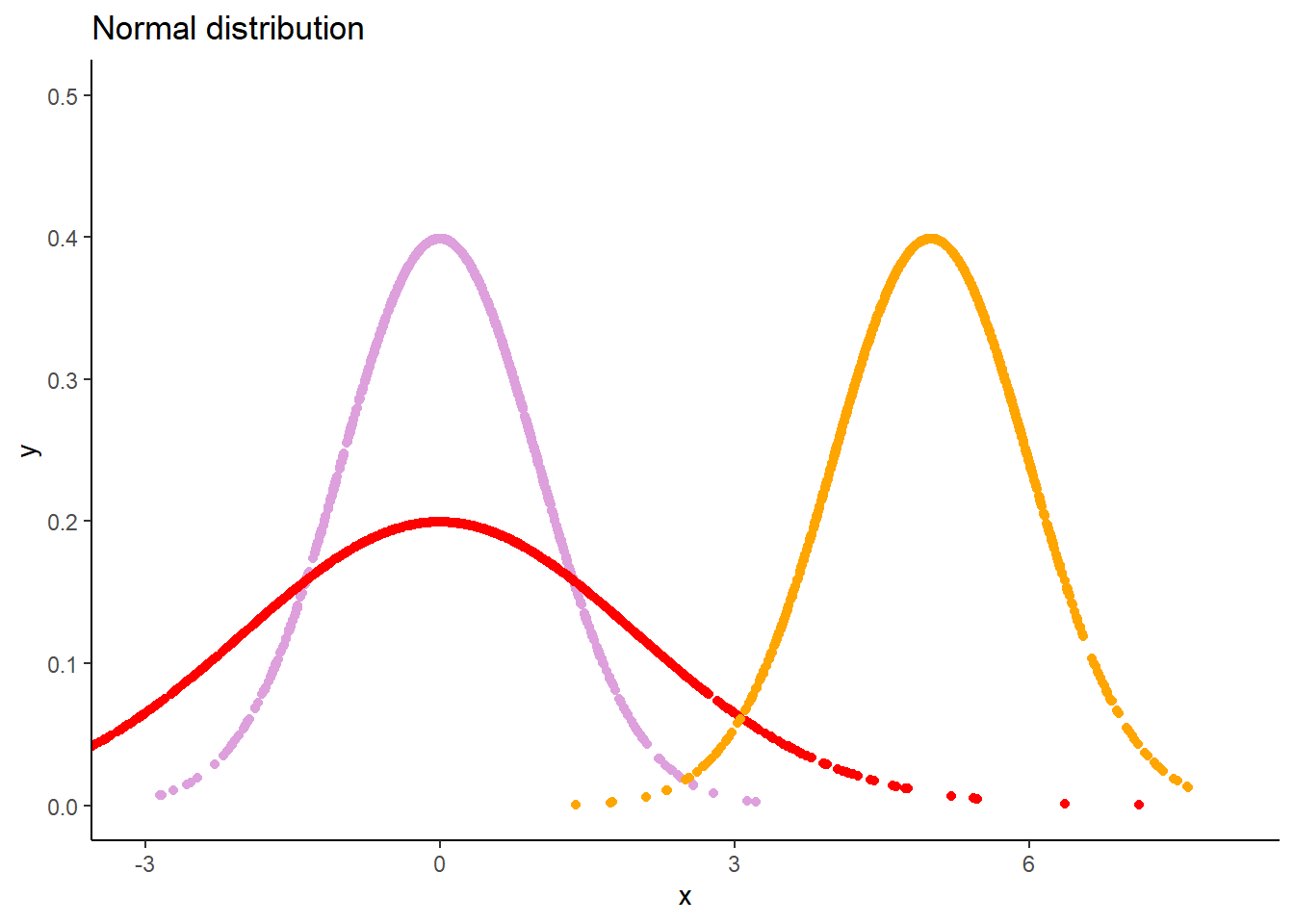
分別從 \(N(\mu = 0, \sigma = 1)\)、\(N(\mu = 0, \sigma = 2)\)、\(N(\mu = 5, \sigma = 1)\) 抽出 1000 個樣本。
其中,\(N\) 表示常態分佈,\(\mu\) 表示平均值,\(\sigma\) 表示標準差。
畫圖比較
相同的平均值,不同的標準差
不同的平均值,相同的標準差
df <- data.frame(
  matrix(0, nrow = 1000, ncol = 2))

df[[1]] <- rnorm(n = 1000, mean = 0, sd = 1)
df[[2]] <- dnorm(df[[1]], mean = 0, sd = 1)
rnorm() 隨機抽樣
dnorm() 抽出樣本的機率
plot(x = df[[1]], y = df[[2]])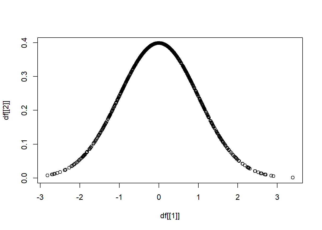
依此類推,分別對三種分布抽出 1000 個樣本。
df <- data.frame(
  matrix(0, nrow = 1000, ncol = 6))

df[[1]] <- rnorm(1000, mean = 0, sd = 1)
df[[2]] <- dnorm(df[[1]], mean = 0, sd = 1)
df[[3]] <- rnorm(____, mean = 0, sd = 2)
df[[4]] <- dnorm(____, mean = 0, sd = 2)
df[[5]] <- rnorm(____, mean = 5, sd = 1)
df[[6]] <- dnorm(____, mean = 5, sd = 1)
知道函數 argument 的順序,可以省略 argument。
# 這兩個一樣
df[[1]] <- rnorm(1000, mean = 0, sd = 1)
df[[1]] <- rnorm(1000, 0, 1)
第一小題,在比較相同的平均值,不同的標準差的時候,會需要疊圖,疊圖的方法是使用 par(new = T),
plot(x = df[[1]], y = df[[2]])
par(new = T)
plot(x = df[[3]], y = df[[4]])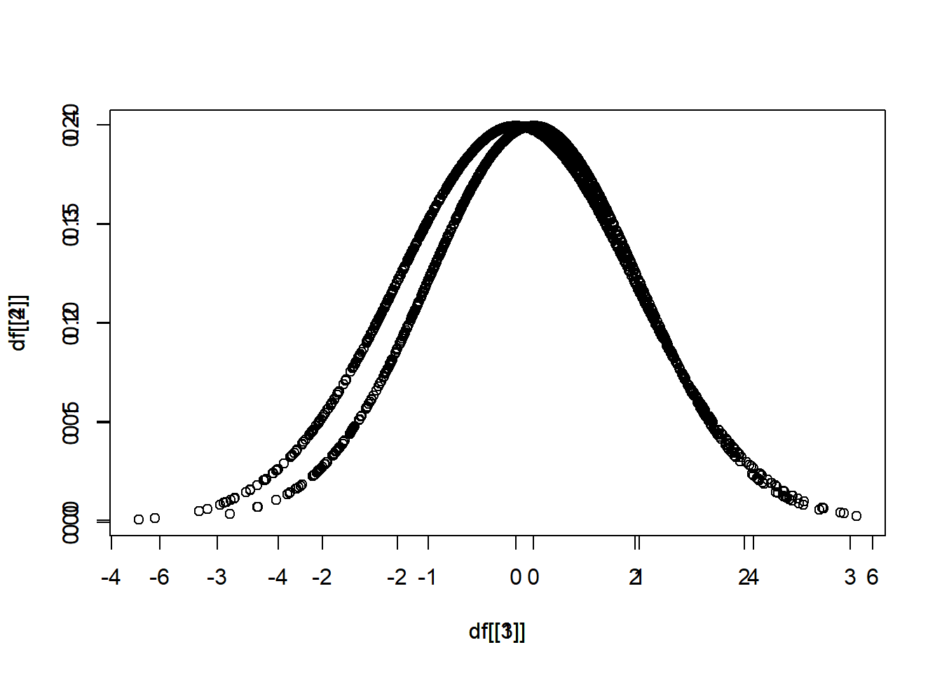
但是尺度可能不一樣,用 xlim(),ylim() 限制範圍。
plot(x = df[[1]], y = df[[2]], xlim = c(-3,3), ylim = c(0,0.5))
par(new = T)
plot(x = df[[3]], y = df[[4]], xlim = c(-3,3), ylim = c(0,0.5))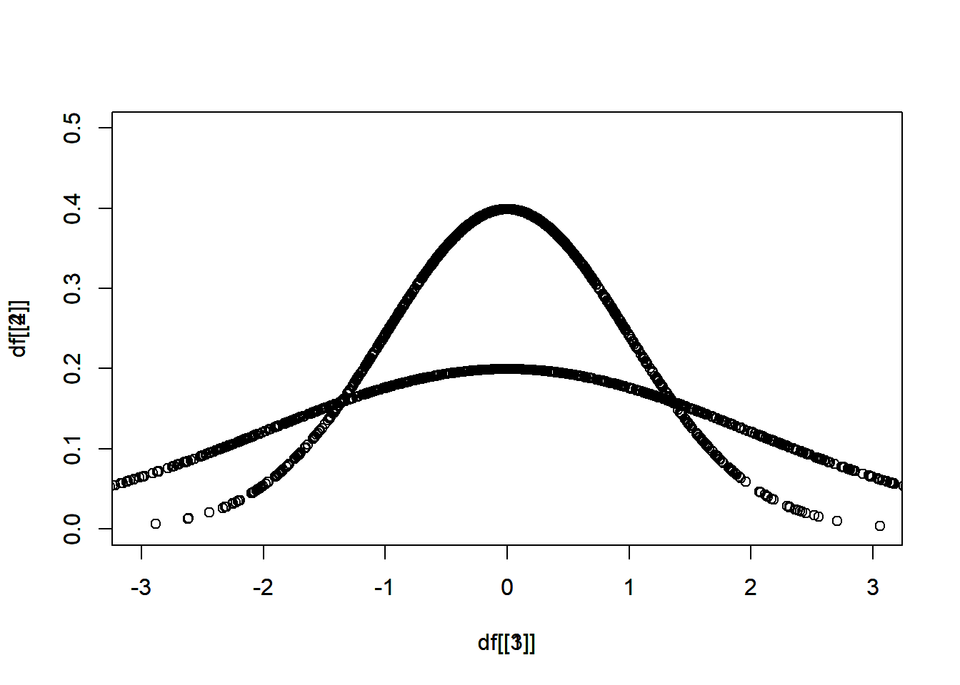
以此類推,第二小題,
plot(x = df[[1]], y = df[[2]], xlim = c(__,__), ylim = c(__,__))
par(new = T)
plot(x = _______, y = _______, xlim = c(__,__), ylim = c(__,__))
統計圖表繪製
學習目標
介紹 plot() 和 ggplot() 的做法。
plot()
df <- data.frame(
  matrix(0, nrow = 1000, ncol = 2))

df[[1]] <- rnorm(1000, mean = 0, sd = 1)
df[[2]] <- dnorm(df[[1]], mean = 0, sd = 1)

plot(x = df[[1]], y = df[[2]],
     xlim = c(-3,3), ylim = c(0,0.5))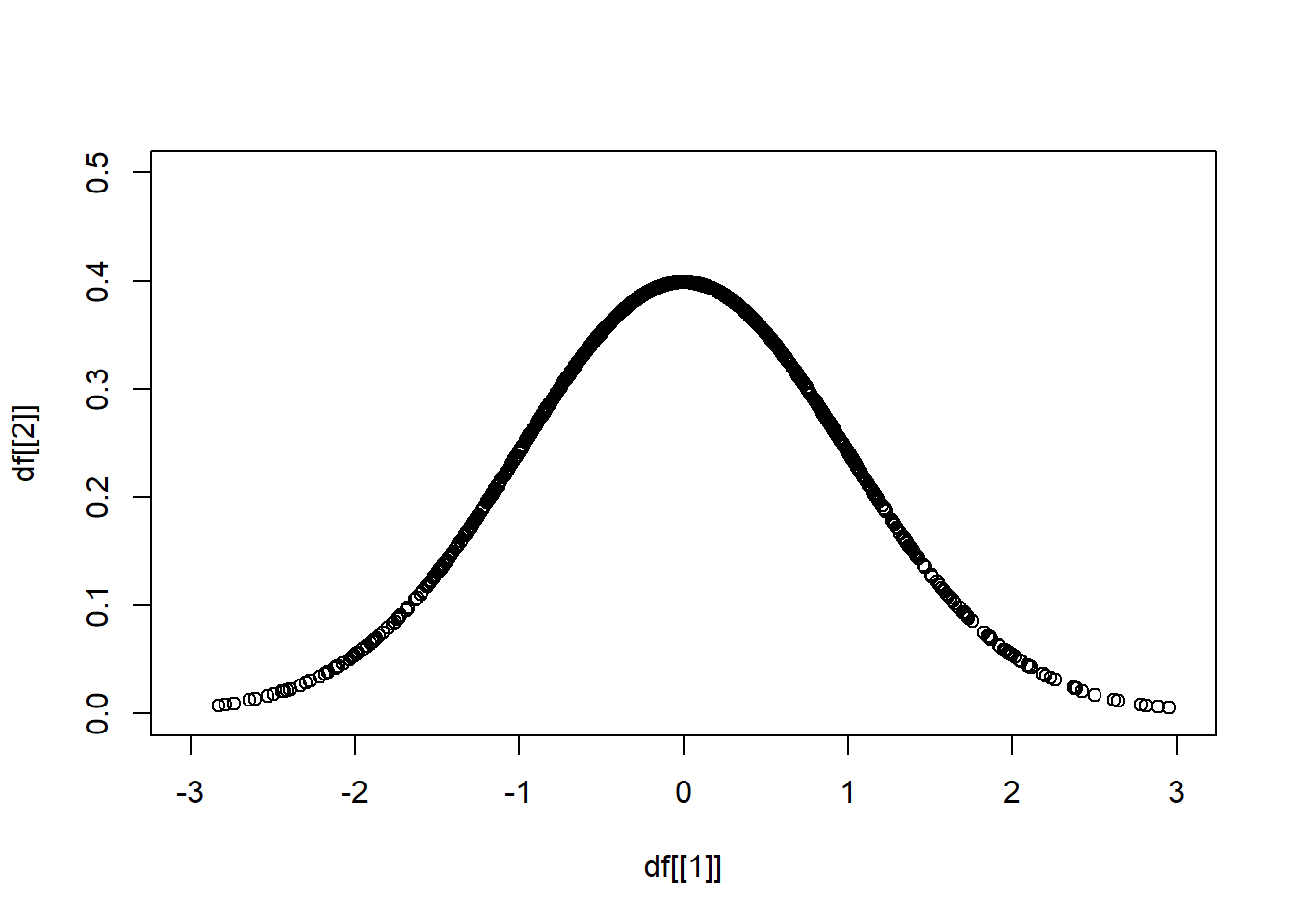
head(df)
#>            X1         X2
#> 1  0.20430300 0.39070269
#> 2  0.16739636 0.39339177
#> 3  1.34378875 0.16173071
#> 4 -2.02201127 0.05165319
#> 5  0.07598758 0.39779217
#> 6 -0.32362088 0.37858912圖表標題,main = "__",
plot(x = df[[1]], y = df[[2]],
     xlim = c(-3,3), ylim = c(0,0.5),
     main = "Normal distribution",
     xlab = "x", ylab = "y")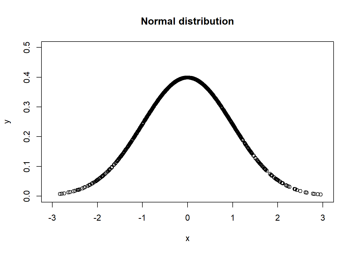
更改坐標軸名稱,xlab = "__",ylab = "__",
plot(x = df[[1]], y = df[[2]],
     xlim = c(-3,3), ylim = c(0,0.5),
     xlab = "x", ylab = "y")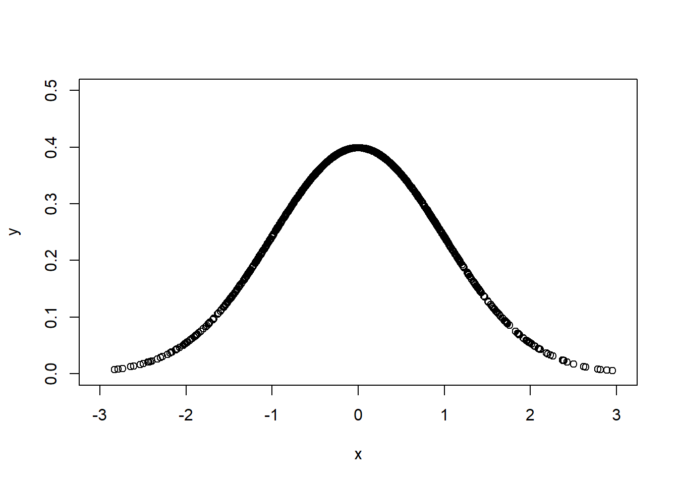
顏色 col = "____",
plot(x = df[[1]], y = df[[2]],
     xlim = c(-3,3), ylim = c(0,0.5),
     col = "plum")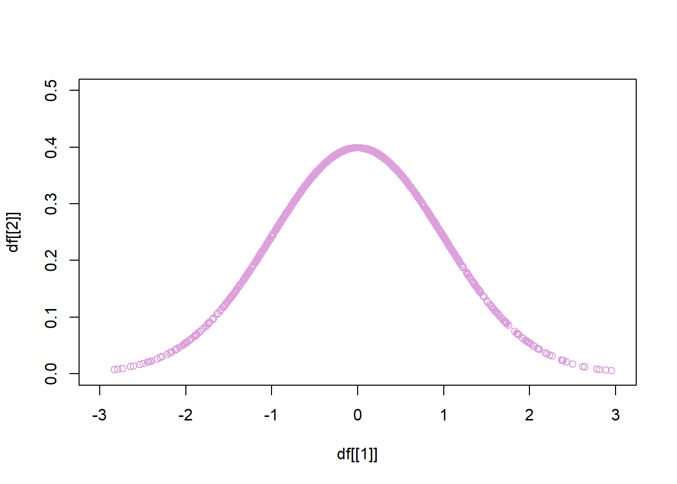
點的形狀 pch = 20,
plot(x = df[[1]], y = df[[2]],
     xlim = c(-3,3), ylim = c(0,0.5),
     pch = 20)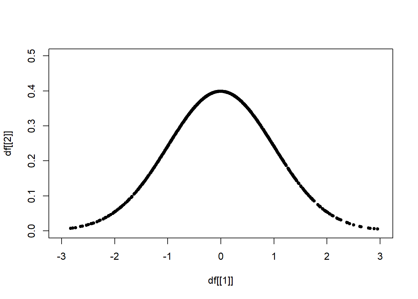
ggplot()
Find the Data Visualization Cheat Sheet
install.packages("ggplot2")
library(ggplot2)
head(df)
#> X1 X2
#> 1 0.20430300 0.39070269
#> 2 0.16739636 0.39339177
#> 3 1.34378875 0.16173071
#> 4 -2.02201127 0.05165319
#> 5 0.07598758 0.39779217
#> 6 -0.32362088 0.37858912基本
ggplot(data = df) +
  geom_point(mapping = aes(X1, X2))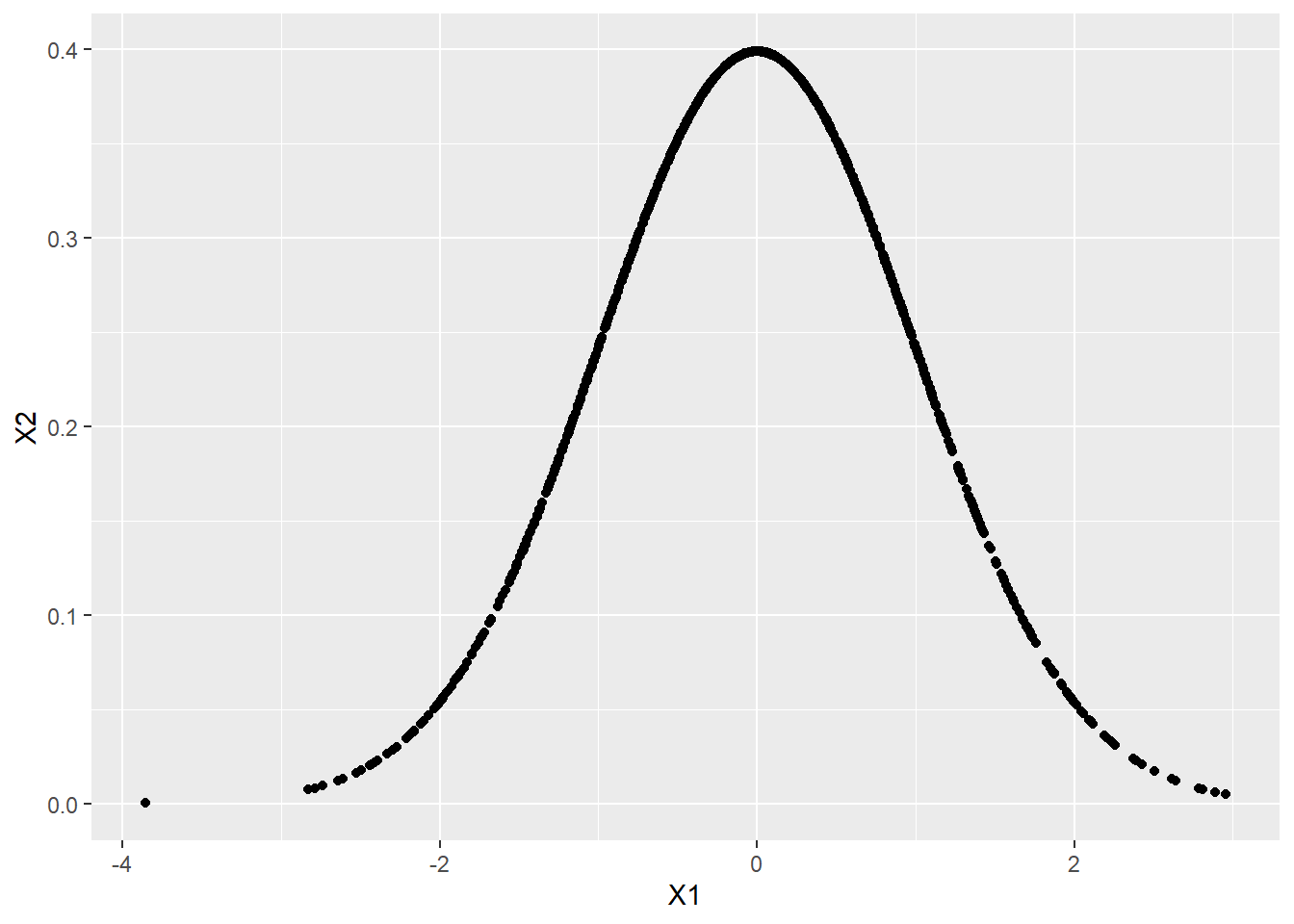
或者也可以寫成
ggplot(df) +
  geom_point(aes(X1, X2))
坐標軸名稱與圖表標題
ggplot(data = df) +
  geom_point(mapping = aes(X1, X2)) +
  labs(x = "x", y = "y", title = "Normal distribution")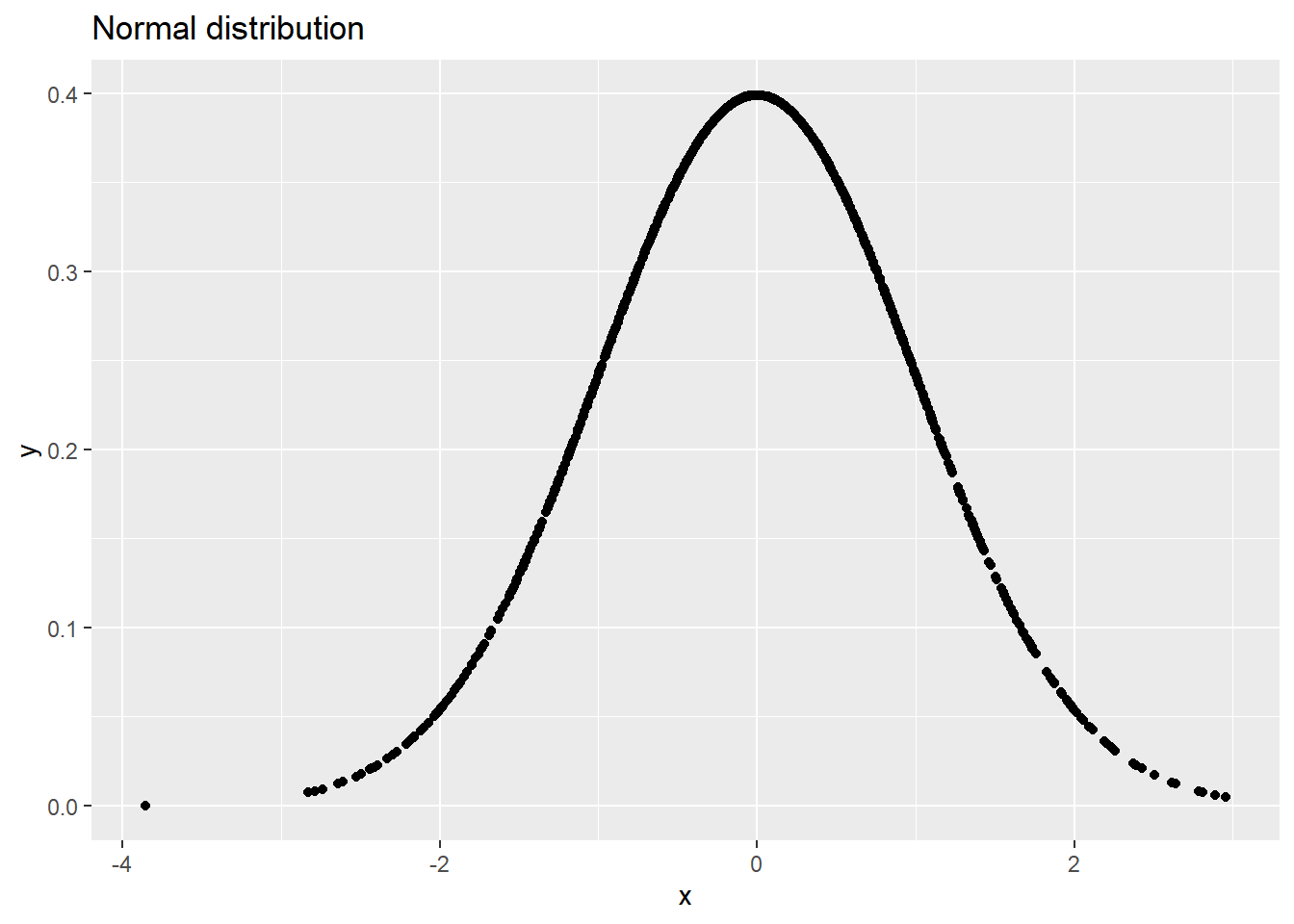
注意 argument 順序
ggplot(df) +
  geom_point(aes(X1, X2)) +
  labs("Normal distribution", "x", "y")
座標軸範圍限制
ggplot(data = df) +
  geom_point(mapping = aes(X1, X2)) +
  coord_cartesian(xlim = c(-3, 3), ylim = c(0, 0.5))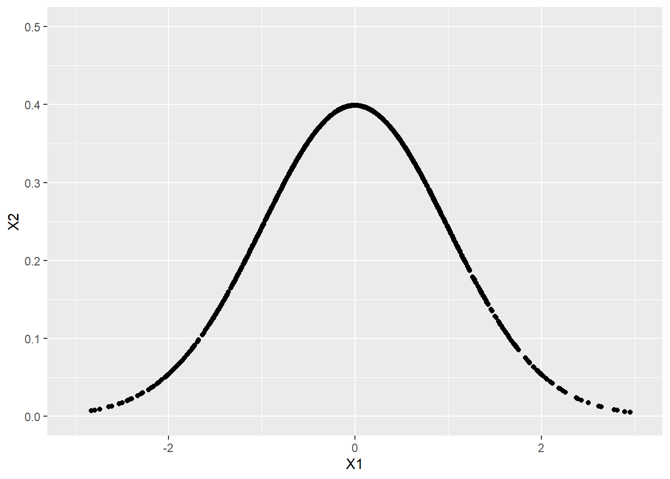
顏色
ggplot(data = df) +
  geom_point(mapping = aes(X1, X2), color = "orange") +
  coord_cartesian(xlim = c(-3, 3), ylim = c(0, 0.5))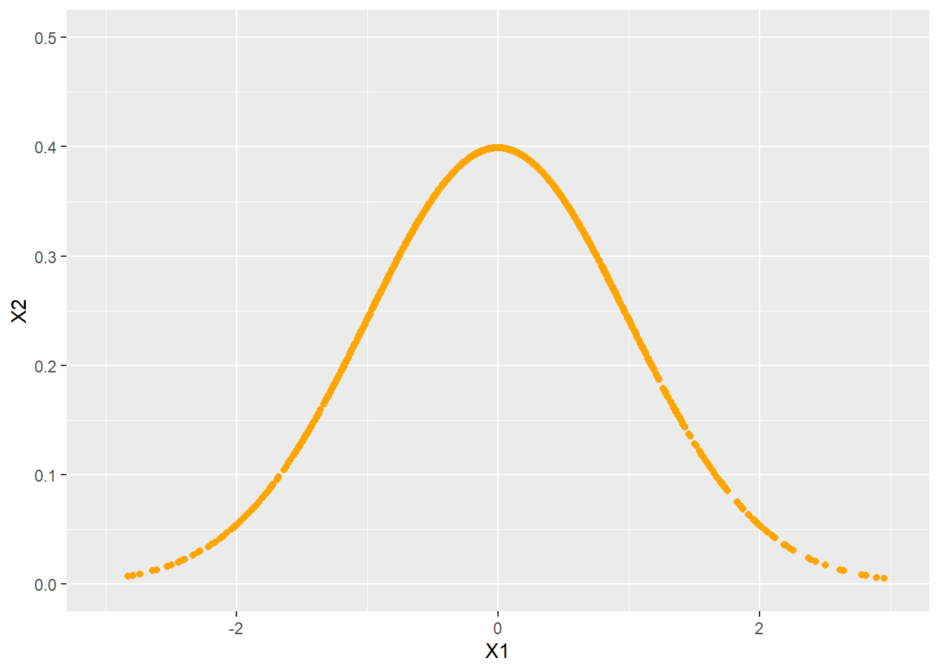
畫圖主題
ggplot(data = df) +
  geom_point(mapping = aes(X1, X2)) +
  theme_classic()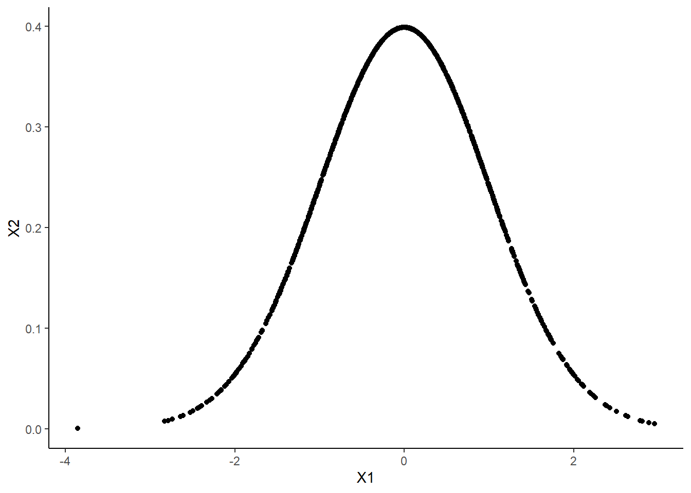
疊圖方法
ggplot(data = df) +
  geom_point(mapping = aes(X1, X2)) +
  geom_point(mapping = aes(X3, X4)) +
  theme_classic()
習題
進一步視覺化,包括 (1) 圖表標題 (2) 坐標軸名稱 (3) 顏色
分別從 \(N(\mu = 0, \sigma = 1)\)、\(N(\mu = 0, \sigma = 2)\)、\(N(\mu = 5, \sigma = 1)\) 抽出 1000 個樣本。
其中,\(N\) 表示常態分佈,\(\mu\) 表示平均值,\(\sigma\) 表示標準差。
畫圖比較
相同的平均值,不同的標準差
不同的平均值,相同的標準差
區間估計
學習目標
了解 qnorm() 和在 R 取“部分”的方法。
qnorm(0, 0, 1)
#> [1] -Inf
qnorm(0.25, 0, 1)
#> [1] -0.6744898
qnorm(0.50, 0, 1)
#> [1] 0
qnorm(0.75, 0, 1)
#> [1] 0.6744898
qnorm(1, 0, 1)
#> [1] Inf
從簡單的樣本出發,
df <- data.frame(
  matrix(0, nrow = 10, ncol = 2))

df[[1]] <- rnorm(10, mean = 0, sd = 1)
df[[2]] <- dnorm(df[[1]], mean = 0, sd = 1)
#> X1 X2
#> 1 -0.30475831 0.38083946
#> 2 -0.10762427 0.39663849
#> 3 0.28347726 0.38323067
#> 4 1.07352563 0.22421112
#> 5 -0.33453007 0.37723244
#> 6 -1.77539597 0.08250025
#> 7 1.07250132 0.22445769
#> 8 -1.07458663 0.22395576
#> 9 2.38093427 0.02343880
#> 10 -0.07079606 0.39794377取出小於 25 百分位的樣本,注意逗點位置,
df[df$X1 < qnorm(0.25, 0, 1),]
#>          X1         X2
#> 6 -1.775396 0.08250025
#> 8 -1.074587 0.22395576
df[df[[1]] < qnorm(0.25, 0, 1),]
#>          X1         X2
#> 6 -1.775396 0.08250025
#> 8 -1.074587 0.22395576兩個以上的條件,& 表示“且”,| 表示“或”,取出小於 25 百分位的樣本或大於 75百分位的樣本。
df[df$X1 < qnorm(0.25, 0, 1) | df$X1 > qnorm(0.75, 0, 1),]
#> X1 X2
#> 4 1.073526 0.22421112
#> 6 -1.775396 0.08250025
#> 7 1.072501 0.22445769
#> 8 -1.074587 0.22395576
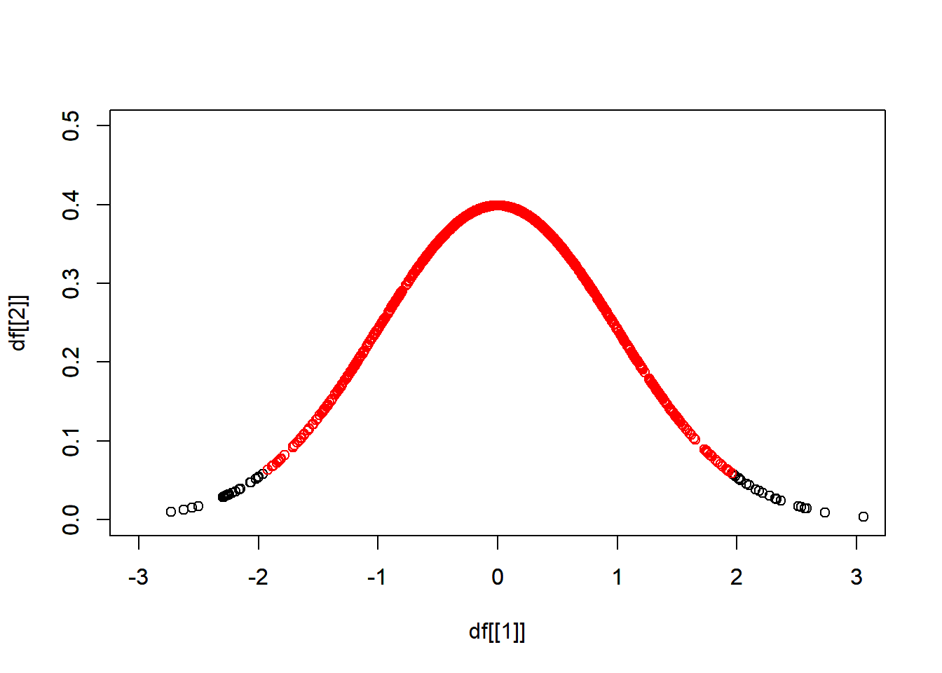
#> 9 2.380934 0.02343880習題
從 \(N(\mu = 0, \sigma = 1)\) 抽出 1000 個樣本,找出其雙尾 95% 信賴區間,區間內的樣本以紅色表示。